
Land Treatment Exploration Tool

An official website of the United States government
Here’s how you know
Official websites use .gov
A .gov website belongs to an official government
organization in the United States.
Secure .gov websites use HTTPS
A lock () or https:// means you’ve safely connected to
the .gov website. Share sensitive information only on official,
secure websites.
Land Treatment Exploration Tool
Upload a shapefile:
or Draw a treatment boundary:
Need to edit your treatment area on the map? Click on it and move the vertices. You will not be able to identify features under your proposed treatment while at this step.
Download the proposed treatment polygon as:
Toggle the options in the Site History tab to view treatment, wildfire, vegetation, climate, and recent drought history. Historical climate is viewable as the 30 year (1980 - 2010) averages displayed as a climatogram.
Look up on-the-ground monitoring in the Monitoring tab.
Preview endangered species, migratory birds, facilities, and wetlands information for your area through the IPaC tab.
View overlays of the numerous layers available on the Planning Map.
View future drought forecasts for temperature, precipitation and soil moisture on the Drought Forecast tab.
Go back to Step 2 to adjust your planned treatment boundary, if necessary.
How do you want to search for treatments?
To search for matching LTDL treatments spatially, first select a buffer distance, political boundary..., or ecological boundary from the list below. Political and ecological boundaries are automatically determined by the location of your proposed treatment. If two or more boundaries overlap your treatment, all overlapping boundaries will be utilized in the treatment search. Next, you have the option of running a similarity calculation that statistically compares and ranks the similarity of your proposed treatment to those in the LTDL based upon climate, heat load, or landform. Similarity calculations will take several minutes to run as the process is done on the fly, so be patient. However, running all three calculations at once will not increase processing time because they are run independently and in parallel. Once you have selected a buffer or boundary and select the optional similarity calculations you wish to run, the 'Query the LTDL' button will appear at the bottom of Step 4. Click this button to start the query and proceed to Step 5. The query status will be updated as text messages in the 'Query status' section at the bottom on Step 4. more
While this processes, explore the Site History for your proposed treatment area.
Select the layers to view on the map. After clicking this, you will see the legend and a tab to change the opacity of the layer. If a layer is currently grayed out, you are outside the visibility scale. Zoom in and the layer will become active.
- | + | |||
- | + | |||
- | + | |||
- | + | |||
- | + | |||
- | + | |||
- | + | |||
- | + | |||
- | + | |||
- | + | |||
- | + | |||
- | + | |||
- | + | |||
- | + | |||
- | + | |||
- | + | |||
- | + | |||
- | + | |||
- | + | |||
- | + | |||
- | + | |||
- | + | |||
- | + | |||
- | + | |||
- | + | |||
- | + | |||
- | + | |||
- | + | |||
- | + | |||
- | + | |||
- | + | |||
- | + | |||
- | + | |||
- | + | |||
- | + | |||
- | + | |||
- | + | |||
- | + | |||
- | + | |||
- | + | |||
- | + | |||
- | + | |||
- | + | |||
- | + | |||


")


")


")


")
")
Print | ▼ |
The Bureau of Land Management (BLM) Assessment, Inventory, and Monitoring (AIM) program monitors the status, condition, and trend of national BLM resources in accordance with BLM polices. The AIM Strategy - a standardized monitoring strategy for assessing natural resource condition and trend on BLM public lands, specifies a probabilistic sampling design, standard core indicators and methods, electronic data capture and management, and integration of on-the-ground collected field data with remotely sensed data. All data collection and management are carried out by BLM Field Offices, BLM Districts, and/or affiliated field crews with support from the BLM National Operations Center. Data are stored in a centralized database (TerrADat, BLM AIM Lotic Database) at the BLM National Operations Center and available at https://gbp-blm-egis.hub.arcgis.com/pages/aim.
This tab identifies monitoring points within and near the proposed treatment polygon. Refine the search distance by typing a distance - in miles, in the box below. The map will display the proposed treatment, the search area, and the monitoring points. The tables under the map display the monitoring point data within and near the polygon. Click a row to highlight the monitoring point in the map. Check the box for a row to add the selected monitoring point data to the Site Characterization Report. Click a species code - the black ovals with white lettering, to view information on that species in the USDA plants database.
Print | ▼ |
| Implemented_Major_Treatments |
| All Treatment Types |
Times treated | |||||||||||||||
|
| Times Treated |
| PlanningToolTreatments |
| LTDL Treatments |
Trt_Type_Major | |||||||||||||||||||||||||||
|
| Trt_ID | Treatment_Type | Project | Percent_Overlap |
|---|---|---|---|
| No data available in table | |||
| USGS_Combined_Wildland_Fire_Rasters_FY21 |
| USGS_Wildfire_Frequency_Raster_FY21_Version |
Value | ||||||||||||
|
- | + | |||
Below, we provide a map of one of the most useful drought indices for translating meteorological drought into an index that is able to represent moisture in ecosystems, known as SPEI, the Standardized Precipitation Drought Index (Vicente Serrano et al. 2010), which is useful in assessing how "drought" prone site(s) of interest are based on long-term climate and tendency for the site to have annual deviations from climate. Several drought indices are available, but SPEI has become more widely used in settings such as the western US because the index incorporates temperature through basic calculation of precipitation minus potential evapotranspiration, and furthermore has been standardized using more complex calculations to make the index scalable for different applications (from the site to continent). SPEI values should be zero in the long term, unless directional change in moisture availability is occurring across the specified time range. SPEI typically range from approximately +2 to -2 for substantive wet and dry periods, respectively, and up to +4 and -4 for extreme wet or dry periods.
For the most recent SPEI Drought Map, see the SPEI Global Drought Monitor .
| SPEI |
| SPEI 2001-2014 Standard Deviation |
Value | |||
|
- | + | |||
| Similarity to LTDL Treatment | Treatment Evaluation | ||||||||||||||
|---|---|---|---|---|---|---|---|---|---|---|---|---|---|---|---|
| Climate Rank (Value) | Heat Load Rank (Value) | Landform Rank (Value) | Project | Treatment Category | Treatment Type | Year | Imp | Poly | SL | Res | Mon | Ver | |||
Similarity to LTDL Treatment | Treatment Evaluation | ||||||||||||||
|---|---|---|---|---|---|---|---|---|---|---|---|---|---|---|---|
Climate Rank (Value) | Heat Load Rank (Value) | Landform Rank (Value) | Project | Treatment Category | Treatment Type | Year | Imp | Poly | SL | Res | Mon | Ver | |||
| Waiting for data | |||||||||||||||
| Treatment Evaluation | |||||||||||||
|---|---|---|---|---|---|---|---|---|---|---|---|---|---|
| Climate Rank (Value) | Heat Load Rank (Value) | Landform Rank (Value) | Project | Treatment Category | Treatment Type | Year | Imp | Poly | SL | Res | Mon | Ver | |
| No data available in table | |||||||||||||
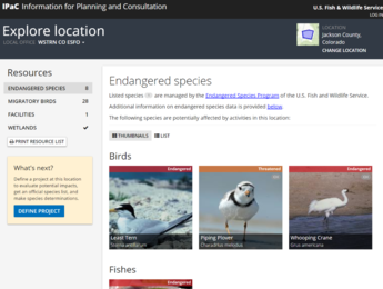
The USFWS Information for Planning and Consultation Project (IPaC) tool was developed by the USFWS to streamline their environmental review process. IPaC helps to identify listed species, critical habitat, migratory birds or other natural resources that may be affected by a proposed project.
After the treatment boundary is created and at Step 3 – Explore site characteristics, some of the information available from the IPaC tool will be displayed below. A unique URL to an individual IPaC project will be generated for each project created using the LTET. If you want to log in and explore the full capabilities of the IPaC tool, go to (waiting for URL) resend treatment information
The first section below includes listed species that may be affected by the proposed project. IPaC provides the LTET with a list of species that are endangered, threatened, candidate, or proposed for listing. The LTET adds information on the status, description, where they are found, and a link to each Environmental Conservation Online System (ECOS) species profile. The second section below is a list of USFWS Birds of Conservation Concern or other vulnerable bird species. Data are provided from the Avian Knowledge Network data store and are additional species that may warrant attention in the proposed project area. The last section below shows data from the National Wetlands Inventory, including an interactive map, data table(s), and definitions.
Access their Frequently Asked Questions here: https://ecos.fws.gov/ipac/#faq
Weather variability is well known to have strong effects on land treatment application and outcomes particularly in dryland ecosystems. Intra-annual variations in seasonal water and temperature is especially important, such as those driven by particular storms or short-term events that last weeks or months. Past research has demonstrated the importance of weather, and drought in particular, on the success or failure of dryland restoration (e.g. Brabec et al. 2017; Hardegree et al. 2018, Shriver et al. 2018, Moffett et al. 2019).
This tool forecasts seasonal weather and soil water availability to help plan treatments such as herbicide or seeding after wildfires. The forecasts may help in understanding past treatment results, and/or evaluate climate and weather effects on treatments.
The Seasonal Ecological Drought Forecast Tool estimates soil moisture conditions for 12 months into the future by integrating National Weather Service regional seasonal temperature and precipitation forecasts, including uncertainty, with an ecosystem water balance model. Users select a point location and can specify soil texture or use gridded soils data SSURGO and STATSGO. The Seasonal Ecological Drought Forecast tool generates site-specific temperature, precipitation and soil moisture forecasts and compares forecasted conditions to historical conditions at 4km resolution. These forecasts can help assess the potential impact of drought on land treatments in the next 12 months. The Seasonal Ecological Drought Forecast tool also forecasts sagebrush establishment success for the coming season. Metrics for additional plant species are planned for future versions of the tool.
The latitude and longitude shown in the map box to the left represents a central point for the planned treatment boundary created in Step 2. The point can be changed by clicking on the 'Point' button below the map to clear the current selection and clicking a new point on the map. The Seasonal Ecological Drought Forecast tool is set by default to use gridded soils data to determine the percent clay and sand for the location. Click the 'Specify Soils' radio button to show fields to specify values for the percent clay and sand. Click the 'Calculate' button when location and soils selections are complete. It may take 3-5 minutes for the Seasonal Ecological Drought Forecast tool to return a report. The results will display below and consist of a summary, shown first, and overview graphs of soil moisture, air temperature, and precipitation. Clicking the section headers opens detailed sections for each metric. See the User Guide Drought Forecast tab for more detailed instructions on how to use this tool and interpret its results.
To the right is a graphical summary of the detailed sections below. The quick view figure displays soil moisture, temperature, and precipitation (30-day rolling average) for the selected site for the past 6 months and the modeled future 12 months.
Below are these metrics in more detail and in comparison to long-term historical average conditions and long-term variation in historical conditions. Figures also show the difference between forecasted conditions and the long-term average, which can be used to assess how the coming year is expected to differ from typical conditions at the site. These results can be useful for evaluating the potential outcomes of land treatments and land management decisions.
The figure above shows an 18-month time series of soil moisture (volumetric water content) values in TOP soils. The time series includes recent (the last 6 months) observations on the left and forecasted values (the next 12 months) on the right. Variability in forecasted values is a result of uncertainty in the seasonal outlooks for temperature and precipitation. toggle long description
The historical median of the 30-day rolling average (black line), and 10th and 90th quantile (gray shaded area) were calculated for the climatological normal period (1981 – 2011) and represent reference conditions for this site. The vertical, dashed red line on the figure is today’s date and the vertical, dashed black line is the date of the most recent data from gridMet. To the left of the vertical red line are the observed dailys (dashed yellow line, data from gridMet, and a 30 day rolling average of observations (solid yellow line). To the right of the red line are the approximated daily means (thick purple line), and the 10th and 90th (shaded purple) values for the upcoming year. More about the development of these forecasts can be found at https://github.com/DrylandEcology/ShortTermDroughtForecaster.
The figure above shows an 18-month time series of soil moisture (volumetric water content) deviations from the long-term site median of the 30-day rolling average in TOP soils. The vertical, dashed red line on the figure is today’s date and the vertical, dashed black line is the date of the most recent data from gridMet. The time series includes recent (the last 6 months) observations on the left and forecasted values (the next 12 months) on the right. The long-term historical normal for each day is plotted in the background to help compare the recent past and future to reference conditions. This figure helps users determine if soils are expected to be wetter or drier than normal. toggle long description
The historical normal is calculated as the median of 30-day rolling average taken over 1981 – 2011. In this figure the normal is set to 0 (horizontal black line) and the 10th to 90th percentile of this period is shaded in gray. The vertical, dashed red line on the figure is today’s date and the vertical, dashed black line is the date of the most recent weather data from gridMet. The difference between the historical normal and the recent past/upcoming year are represented in green (greater than historical normal) and brown (less than historical normal) shaded areas. The differences between the 10th and 90th percentiles of the future and the historical normal are represented as dashed purple lines.
Future forecasts show variation at the monthly timescale (that are interpolated to daily) because that is the timescale of the National Weather Service forecasts. For more information, see the User Guide.
The figure above shows an 18-month time series of air temperature. The time series includes recent (the last 6 months) observations on the left and forecasted values (the next 12 months) on the right. Variability in the forecasted values is a direct result of variability in the seasonal temperature outlooks. toggle long description
The historical median of the 30-day rolling average (black line), and 10th and 90th quantile (gray shaded area) were calculated for the climatological normal period (1981 – 2011) and represent reference conditions for this site. The vertical, dashed red line on the figure is today’s date and the vertical, dashed black line is the date of the most recent data from gridMet. To the left of the vertical red line are the observed dailys (dashed yellow line, data from gridMet, and a 30 day rolling average of observations (solid yellow line). To the right of the red line are the approximated daily means (thick purple line), and the 10th and 90th (shaded purple) values for the upcoming year. More about the development of these forecasts can be found at https://github.com/DrylandEcology/ShortTermDroughtForecaster.
The figure above shows an 18-month time series of air temperature deviations from the long-term climatological normal for your site. The time series includes recent (the last 6 months) observations on the left and forecasted values (the next 12 months) on the right. The long-term historical normal for each day is plotted in the background to help compare the recent past and future to reference conditions. This figure helps users determine if the temperature is expected to be warmer or cooler than normal. toggle long description
The historical normal is calculated as the median of 30-day rolling average taken over 1981 – 2011. In this figure the normal is set to 0 (horizontal black line) and the 10th to 90th percentile of this period is shaded in gray. The vertical, dashed red line on the figure is today’s date and the vertical, dashed black line is the date of the most recent weather data from gridMet. The difference between the historical normal and the recent past/upcoming year are represented in red (warmer than historical normal) and blue (cooler than historical normal) shaded areas. The differences between the 10th and 90th percentiles of the future and the historical normal are represented as dashed purple lines.
Future forecasts show variation at the monthly timescale (that are interpolated to daily) because that is the timescale of the National Weather Service forecasts. For more information, see the User Guide.
The figure above shows an 18-month time series of precipitation. The time series includes recent (the last 6 months) observations on the left and forecasted values (the next 12 months) on the right. Variability in the forecasted values is a direct result of variability in the seasonal precipitation outlooks. toggle long description
The historical median of the 30-day rolling average (black line), and 10th and 90th quantile (gray shaded area) were calculated for the climatological normal period (1981 – 2011) and represent reference conditions for this site. The vertical, dashed red line on the figure is today’s date and the vertical, dashed black line is the date of the most recent data from gridMet. To the left of the vertical red line are the observed dailys (dashed yellow line, data from gridMet, and a 30 day rolling average of observations (solid yellow line). To the right of the red line are the approximated daily means (thick purple line), and the 10th and 90th (shaded purple) values for the upcoming year. More about the development of these forecasts can be found at https://github.com/DrylandEcology/ShortTermDroughtForecaster.
The figure above shows an 18-month time series of precipitation deviations from the long-term climatological normal for your site. The time series includes recent (the last 6 months) observations on the left and forecasted values (the next 12 months) on the right. The long-term historical normal for each day is plotted in the background to help compare the recent past and future to reference conditions. This figure helps users determine if precipitation is expected to be less than or greater than normal. toggle long description
The historical normal is calculated as the median of 30-day rolling average taken over 1981 – 2011. In this figure the normal is set to 0 (horizontal black line) and the 10th to 90th percentile of this period is shaded in gray. The vertical, dashed red line on the figure is today’s date and the vertical, dashed black line is the date of the most recent weather data from gridMet. The difference between the historical normal and the recent past/upcoming year are represented in green (greater than historical normal) and brown (less than historical normal) shaded areas. The differences between the 10th and 90th percentiles of the future and the historical normal are represented as dashed purple lines.
Future forecasts show variation at the monthly timescale (that are interpolated to daily) because that is the timescale of the National Weather Service forecasts. For more information, see the User Guide.
Estimates of future seeding success can be made from the findings of historic relationships of post-fire sagebrush seeding success to soil-moisture and temperature conditions in and around the Great Basin. Below are estimates of big sagebrush seeding outcomes for the coming season derived from two recent publications. The first study (Shriver et al. 2018) identified that seeding success is greater where and when spring moisture is greater. The second study (O'Connor et al. 2020) further discovered that successful seedings had seven additional days of soil water available to seeds and seedlings based on soil physical properties (e.g. texture) when soils were above freezing, compared to unsuccessful sites.
These metrics were developed under the SageSuccess Project, which is a joint effort between USGS, BLM, and FWS. This study related soil water content in early spring and site air temperature the first half of the year to post-wildfire sagebrush seeding success. The results indicated big sagebrush occurrence is most strongly associated with relatively cool temperatures and wet soils in the first spring after seeding. The resulting forecasts help identity where and when seedings might be more or less successful.
In , there is a % chance that probability of establishment is above historical median
In , there is a % chance that probability of establishment is above historical median
The boxplot on the left represent the median and the range of sagebrush establishment in the climatic normal period (1981 - 2011). Individual points of probability of success in more recent years are marked. The center and right-most boxplot are predictions for probability of success for and . The boxplots represent the range across potential realizations of the future. Data for will not be displayed until at least 6 months of forecast data are available for that year.
These metrics were developed by the USGS under the Climate Adaptation Science Center (CASC) Ecological Drought Index study. This study used the SageSuccess data and included additional post-wildfire seeding areas for statistical validation, and considered whether the modeled soil-water contents were in the plant-available range during sagebrush germination and emergence (March). Soil-water availability relates to how strongly bound soil water is to soil. Values 0 to -1.5 MPa (megapascals) are typically easily extracted by most wildland plants while values below -2.5 MPa cannot be extracted by most plants, including sagebrush seedlings. This study found that successful seedings had seven additional days of soil water available to seeds and seedlings based on soil physical properties (e.g. texture) when soils were above freezing, compared to unsuccessful sites. These figures allow for the comparison between the user selected location and sites where sagebrush was or was not present.
Mean Daily Soil Water Potential
Mean daily soil water potential (top layer of soil/0-5cm only) in March across all sites used in O’Connor et al. 2020 study, where sagebrush was present (blue) and absent (orange), with a 95% confidence interval in shaded band. The predicted conditions for the selected site and 95% confidence interval are shown in purple. If 'Today's' date falls in March, days in March before 'Today' are observed values (yellow) and days in March after 'Today' are the predicted values (purple) for the remainder of the month. If the purple and blue lines are similar, then the selected site is predicted to have a similar soil water potential in March as did sites where sagebrush was present post wildfire seeding. Note that predicted values are more accurate for values in the near future than those in the more distant future.
Mean Daily Soil Temperature
Mean daily soil temperature (top layer of soil/0-5cm only) in March across all sites used in O’Connor et al. 2020 study, where sagebrush was present (blue) and absent (orange), with a 95% confidence interval in shaded band. The predicted conditions for the selected site and 95% confidence interval are shown in purple. If 'Today's' date falls in March, days in March before 'Today' are observed values (yellow) and days in March after 'Today' are the predicted values (purple) for the remainder of the month. If the purple and blue lines are similar, then the selected site is predicted to have a similar soil temperature in March as did sites where sagebrush was present post wildfire seeding. Note that predicted values are more accurate for values in the near future than those in the more distant future.
Previous research (Schlaepfer et al. 2014a) has evaluated how natural sagebrush regeneration (e.g. germination and survival from seed produced by established big sagebrush plants) is influenced by soil moisture, temperature, snowpack, and other conditions. Natural regeneration is a very different process from seeding establishment during restoration. Below is the forecasted probability of conditions supporting sagebrush seedling survival for natural regeneration in an unburned, intact sagebrush plant community.
This study reviewed the literature to identify important drivers of big sagebrush regeneration (Schlaepfer et al. 2014b) and built a model based on those drivers that estimates big sagebrush regeneration potential on an annual basis, parameterized with field observations (Schlaepfer et al. 2014a). These regeneration patterns and forecasts relate to unburned, intact sagebrush plant communities.
In , there is a % chance that probability of survival is above historical mean.
In , there is a % chance that probability of survival is above historical mean.
The point on the left is the mean of conditions supporting sagebrush in the climatic normal period (1981 - 2010). The center and right-most boxplot are predictions for sagebrush survival in and . The boxplots represent the range across potential realizations of the future. Data for will not be displayed until at least 6 months of forecast data are available for that year.
Brabec, M.M., Germino, M.J. and Richardson, B.A., 2017. Climate adaption and post‐fire restoration of a foundational perennial in cold desert: Insights from intraspecific variation in response to weather. Journal of Applied Ecology, 54(1), pp.293-302.
Hardegree, S.P., Abatzoglou, J.T., Brunson, M.W., Germino, M.J., Hegewisch, K.C., Moffet, C.A., Pilliod, D.S., Roundy, B.A., Boehm, A.R. and Meredith, G.R., 2018. Weather-centric rangeland revegetation planning. Rangeland Ecology & Management, 71(1), pp.1-11.
Moffet, C.A., Hardegree, S.P., Abatzoglou, J.T., Hegewisch, K.C., Reuter, R.R., Sheley, R.L., Brunson, M.W., Flerchinger, G.N. and Boehm, A.R., 2019. Weather Tools for Retrospective Assessment of Restoration Outcomes. Rangeland ecology & management, 72(2), pp.225-229.
O’Connor, R.C., Germino, M.J., Barnard, D.M., Andrews, C.M., Bradford, J.B., Pilliod, D.S., Arkle, R.S. and Shriver, R.K., 2020. Small-scale water deficits after wildfires create long-lasting ecological impacts. Environmental Research Letters, 15(4), p.044001.
Schlaepfer, D. R., W. K. Lauenroth, and J. B. Bradford. 2014a. Modeling regeneration responses of big sagebrush (Artemisia tridentata) to abiotic conditions. Ecological Modelling 286:66-77.
Schlaepfer D. R., Lauenroth W. K., and Bradford J. B. 2014b. Natural regeneration processes in big sagebrush (Artemesia tridentata) Rangeland Ecol. Manage.67344–57.
Shriver R K, Andrews C M, Pilliod D S, Arkle R S, Welty J L,Germino M J, Duniway M C, Pyke D A and Bradford J B 2018. Adapting management to a changing world: warm temperatures, dry soil, and interannual variability limit restoration success of dominant woody shrub in temperate drylands. Glob. Change Biol.244972–82.
The Climate Prediction Center (CPC) of the National Weather Service (NWS) provides 'long-lead outlooks' for temperature and precipitation for 102 regions for the 48 contiguous U.S. states. These outlooks are the probability of whether a region will be hotter or cooler (temperature) and wetter or drier (precipitation) than their 30-year climatological normal (1980-2010) for multi-month forecasts and are updated each month.
The Short-term Drought Forecast API translates the information from the NWS CPC into predictions that are fine-tuned for specific locations, instead of the broad outlooks provided for 102 regions. In addition, monthly predictions are translated to a finer temporal scale, to be utilized as the climate driver in a daily driven, water-balance model, SOILWAT2. SOILWAT2 is a site-specific model, that takes inputs about daily weather, vegetation, and soils (multi-layer), and mechanistically predicts daily soil moisture, a metric used for evaluating likely success of plant germination and survival.
In order to integrate regional outlooks to site-specific predictions, historical weather for a site is downloaded from gridMet. gridMET is a dataset of daily high-spatial resolution (~4-km) surface meteorological data covering the contiguous U.S. from 1979-present. Using patterns between historical temperature and precipitation data, alongside NWS forecasts, a distribution of future anomalies is predicted using multivariate sampling. These predicted anomalies corrected and integrated with historical data from the climatic normal period to simulate potential trajectories in upcoming climate and soil moisture.
Detailed information about this downscaling and statistical process is documented here.
| Attribute | Value |
|---|
Confirmed Implementation: LTDL staff were able to confirm the treatment took place either through documentation or GIS attributes. Since these records have not been verified by the BLM, it is still possible some of the details such as exact spatial location, dates, and seed mixes are inaccurate and no warranty is given as to their accuracy. If you are interested in verifying the details of an Implemented treatment, we recommend you contact the local BLM field office to verify the information.
Unknown Implementation: LTDL staff were unable to confirm that the treatment ever took place either through documentation or GIS attributes. These treatments were fully planned, and it is unknown by LTDL staff whether they ever took place. If you are interested in confirming an Unknown treatment, we recommend you contact the local BLM field office to verify the information.
The column headers are found along the top of the table. Each column can be used to order the table by clicking on the column header. Treatment evaluation color-coded columns on the right side of the table can be used to quickly identify the data quality. In general, the more green columns a treatment has, the more complete and potentially useful it is.
Imp: Implementation status of the treatment
I: Implemented
U: Unknown Implementation
Poly: Implementation status of the GIS shape
AP: Approximate point created by LTDL data entry personnel, true location unknown
AU: Approximate point created by non-LTDL personnel, true location unknown
BA: Digitized by BLM field office personnel, using computer program from aerial imagery
BG: Digitized by BLM field office personnel, using a GPS unit on the ground, Digitized by BLM field office personnel, using an aircraft GPS unit
BI: Digitized by BLM field office personnel, using computer program from satellite imagery
BP: Digitized by BLM field office personnel, using paper map
BU: Digitized by BLM field office personnel, method unknown
DU: Digitized by DOD personnel, method unknown
EU: Digitized from an external website, method unknown
FS: Digitized by Forest Service personnel, method unknown
GS: Exported from an internal USGS Fire Perimeter Layer
LC: Digitized by LTDL data entry personnel using a confirmed map
LI: Digitized by LTDL data entry personnel using location information within documentation
LP: Digitized by LTDL data entry personnel using a planned map
LU: Digitized by LTDL data entry personnel using a map of unknown origin
LV: Digitized by LTDL data entry personnel, merged map from various sources
ND: Polygon status not determined
PS: Digitized by NPS field office personnel, method unknown
SL: Implementation status of the seed list
C: Confirmed seed list
U: Unknown seed list
P: Planned seed list
ND: Seed list not determined
N: No seed least
NA: Not applicable (non-seeding treatment)
Res: Indicates if there is text written in the effectiveness and monitoring text box
Y: Yes, there is text written in this field
N: No, this field has no value
Mon: Indicates if the monitoring checkbox is checked. This box should be checked when quantifiable monitoring took place, and is at least partially available in the LTDL
Y: Yes, quantifiable monitoring data indicated in documentation
N: No quantifiable monitoring data currently available
Ver: Indicates if a BLM personnel has checked and verified the information for the project in the LTDL
Y: Yes, a BLM personnel has verified this information
N: No, a BLM personnel has not verified this information
The similarity value is calculated using a Bray-Curtis calculation. A value closer to 0 is more similar, while a value closer to 1 is dissimilar. Values are ranked from within the results list. This rank will vary with different query distances.
This is the max rank value you want to see for the climate similarity rank. For example, if 20 is input, only the treatments with the top 20 climate similarity ranks will be displayed.
The summary tables are being generated. If the tables do not fill in with data and continue to say 'Waiting for data' after several minutes, select Add to Report in Step 4 again. This will reset the calculation and populate the tables.
The map you see here is linked to the Planning Map tab. You can adjust this Report map by changing the layers in the Planning Map tab.
The Land Treatment Digital Library Matches table is populated in Step 6 when you select treatments of interest to your project.
Don't automatically show this.
We appreciate your patience and will have the tool up and running again as soon as possible. If you have concerns or need information quickly, please email us at LTDL_Project@usgs.gov.
This link will direct you to a non-government website that may have different privacy policies from those of the U.S. Geological Survey.


