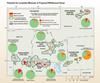
Pie Charts and Sagebrush Focal Areas

Detailed Description
This chart shows the percentage of acreage of each area that has either moderate or high-potential.

Official websites use .gov
A .gov website belongs to an official government organization in the United States.
Secure .gov websites use HTTPS
A lock () or https:// means you’ve safely connected to the .gov website. Share sensitive information only on official, secure websites.
This chart shows the percentage of acreage of each area that has either moderate or high-potential.