
fertilizer application graph

Detailed Description
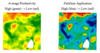
The above images show the relationship between average productivity and prescription for fertilizer application. In this case, high productivity areas (green in the left image) receive a higher level of fertilizer application (blue in the right image). Images courtesy of Mark Foster, SD Consulting (2014).