
Regressive erosion on the Rio Coca upstream of the former San Rafael waterfall site, Ecuador. (Molly Wood, USGS)
Images
Explore water-related photography, imagery, and illustrations.
Filter Total Items: 2415

Regressive erosion on the Rio Coca upstream of the former San Rafael waterfall site, Ecuador
Regressive erosion on the Rio Coca upstream of the former San Rafael waterfall site, Ecuador. (Molly Wood, USGS)

Streambank erosion on the Rio Coca after a waterfall collapse, Ecuador.
Streambank erosion on the Rio Coca after a waterfall collapse, Ecuador. (Molly Wood, USGS)
Streambank erosion on the Rio Coca after a waterfall collapse, Ecuador. (Molly Wood, USGS)

Rapid erosion of hillsides along the Rio Coca in Ecuador after collapse of a lava dam.
Rapid erosion of hillsides along the Rio Coca in Ecuador after collapse of a lava dam, April, 2023. (Molly Wood, USGS)
Rapid erosion of hillsides along the Rio Coca in Ecuador after collapse of a lava dam, April, 2023. (Molly Wood, USGS)

Sediment and flow monitoring station on the Rio Quijos, Rio Coca watershed, Ecuador
Sediment and flow monitoring station on the Rio Quijos, Rio Coca watershed, Ecuador. Rio Quijos joins Rio Salado to form Rio Coca upstream of a hydropower facility. The station is jointly operated by the Ecuador National Institute of Meteorology and Hydrology and the Electric Corporation of Ecuador (CELEC). (Molly Wood, USGS)
Sediment and flow monitoring station on the Rio Quijos, Rio Coca watershed, Ecuador. Rio Quijos joins Rio Salado to form Rio Coca upstream of a hydropower facility. The station is jointly operated by the Ecuador National Institute of Meteorology and Hydrology and the Electric Corporation of Ecuador (CELEC). (Molly Wood, USGS)

Uncertainties: local change - How will climate change affect the timing of fish spawning? (image 1)
linkCircular calendar charts showing the projected effects of climate change on the onset and end of spawning for the American Shad and the Striped Bass in the Hudson River Estuary, during two modeling periods: 1950 to 2012 and 2012 to 2099.

Uncertainties: local change - How will climate change affect the timing of fish spawning? (image 2)
linkCircular calendar charts showing the projected effects of climate change on the onset and end of spawning for the American Shad and the Striped Bass in the Hudson River Estuary, during two modeling periods: 1950 to 2012 and 2012 to 2099.

Upstream diversion dam at Coca Codo Sinclair hydropower facility on the Rio Coca, Ecuador
Upstream diversion dam at Coca Codo Sinclair hydropower facility on the Rio Coca, Ecuador. (Molly Wood, USGS)
Upstream diversion dam at Coca Codo Sinclair hydropower facility on the Rio Coca, Ecuador. (Molly Wood, USGS)

Hinkley, CA Pacific Gas and Electric Company compressor station
A Pacific Gas and Electric Company (PG&E) compressor station in Hinkley, California. Although hexavalent chromium occurs naturally in groundwater in the Mojave Desert, concentrations increased in Hinkley Valley beginning in 1952 when the PG&E discharged it into unlined ponds. From there, hexavalent chromium entered the aquifer.
A Pacific Gas and Electric Company (PG&E) compressor station in Hinkley, California. Although hexavalent chromium occurs naturally in groundwater in the Mojave Desert, concentrations increased in Hinkley Valley beginning in 1952 when the PG&E discharged it into unlined ponds. From there, hexavalent chromium entered the aquifer.

Uncertainties: global change - The loss of the North American grassland biome
The loss of the North American grassland biome. Once spanning more than 2 million square kilometers, we have lost over half of the world’s most imperiled ecosystem: the temperate grasslands. A map of North America shows the loss of the grassland biome from Canada to Mexico, largely contained within the central plains of North America.
The loss of the North American grassland biome. Once spanning more than 2 million square kilometers, we have lost over half of the world’s most imperiled ecosystem: the temperate grasslands. A map of North America shows the loss of the grassland biome from Canada to Mexico, largely contained within the central plains of North America.

Landscape surrounding a Pacific Gas and Electric Company compressor station in Hinkley, California
linkHexavalent chromium, a known carcinogen under specific circumstances, occurs naturally in groundwater in the Mojave Desert. However, concentrations of hexavalent chromium increased in California’s Hinkley Valley beginning in 1952 when the Pacific Gas and Electric Company (PG&E) discharged it into unlined ponds.

Timeseries: tiles - Changes in U.S. water use from 1985 to 2015
A tile map of the U.S. with alluvial charts for each state and the nation that show changes in the total volume of water use from 1985-2015 across eight categories (thermoelectric, irrigation, public supply, industrial, aquaculture, mining, domestic, and livestock).
A tile map of the U.S. with alluvial charts for each state and the nation that show changes in the total volume of water use from 1985-2015 across eight categories (thermoelectric, irrigation, public supply, industrial, aquaculture, mining, domestic, and livestock).

Timeseries: green energy - Electricity generated by renewable energy in the U.S.
Step chart timeseries of U.S. electricity generation (in gigawatt hours) across five classes of renewable energy, from 2000 to 2020. As of 2020, these classes ranked (from high to low): wind, hydropower, solar, bioenergy, and geothermal. From 2000 to 2020, wind power generation steadily grew from roughly 10,000 to over 325,000 gigawatt hours.
Step chart timeseries of U.S. electricity generation (in gigawatt hours) across five classes of renewable energy, from 2000 to 2020. As of 2020, these classes ranked (from high to low): wind, hydropower, solar, bioenergy, and geothermal. From 2000 to 2020, wind power generation steadily grew from roughly 10,000 to over 325,000 gigawatt hours.

Carousel image for the U.S. Groundwater Conditions Data Viz
Carousel image for the U.S. Groundwater Conditions Data Viz. Watch the viz: https://labs.waterdata.usgs.gov/visualizations/gw-conditions/index.html#/
Carousel image for the U.S. Groundwater Conditions Data Viz. Watch the viz: https://labs.waterdata.usgs.gov/visualizations/gw-conditions/index.html#/
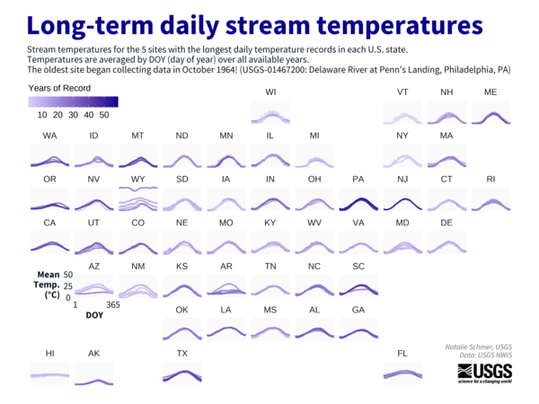
Timeseries: down/upwards - Long-term daily stream temperatures
A tile map of the U.S. showing mean daily stream temperature for the 5 USGS stream sites with the longest daily temperature records in each U.S. state. The oldest site, in Philadelphia, Pennsylvania, began collecting data in October 1964.
A tile map of the U.S. showing mean daily stream temperature for the 5 USGS stream sites with the longest daily temperature records in each U.S. state. The oldest site, in Philadelphia, Pennsylvania, began collecting data in October 1964.

Timeseries: down/upwards - Ocean currents cycle between warmer (el Niño) and cooler (la Niña) periods
linkA timeseries of monthly Oceanic Niño Index values from 1950 to 2023. The y-axis is mirrored at 0, with positive teal values indicating el Niño periods and negative lavender values corresponding to la Niña periods. The chart sits over a watercolor wash that has a gradient from teal at the top to lavender at the bottom.

Trevor Partridge Staff Profile
This is a staff profile photo of Trevor Partridge. Trevor is a Mendenhall Postdoctoral Fellow with the Water Resources Mission Area.
This is a staff profile photo of Trevor Partridge. Trevor is a Mendenhall Postdoctoral Fellow with the Water Resources Mission Area.

Timeseries: correlation - Hysteresis (image 1)
A scatter plot of water temperature versus air temperature on April 27, 2019, for the Paine Run stream in Shenandoah National Park. Points are plotted for each 30-minute interval. Daytime points are hollow, while nighttime points are solid.
A scatter plot of water temperature versus air temperature on April 27, 2019, for the Paine Run stream in Shenandoah National Park. Points are plotted for each 30-minute interval. Daytime points are hollow, while nighttime points are solid.

Timeseries: correlation - Hysteresis (image 2)
Animation showing changes in stream temperature relative to air temperature over the course of a day. The animation begins at midnight, adding a point at each half-hour interval. After dawn, as air temperature starts warming, the stream warms more slowly than air, and water temperature lags behind air temperature.
Animation showing changes in stream temperature relative to air temperature over the course of a day. The animation begins at midnight, adding a point at each half-hour interval. After dawn, as air temperature starts warming, the stream warms more slowly than air, and water temperature lags behind air temperature.

Timeseries: Anthropocene - Grand Canyon Be Dammed
A heatmap of streamflow downstream from the Glen Canyon Dam at USGS gage 09402500 in the Grand Canyon.
A heatmap of streamflow downstream from the Glen Canyon Dam at USGS gage 09402500 in the Grand Canyon.

Relationships: network - Which stream order covers the most distance?
A map of the Potomac River stream network is colored by Strahler stream order, where higher order represents a larger stream. Next to the map is a donut chart, showing that small headwater streams (order 1) make up 57% of the river network, by length. The first three orders of streams, together, make up 87% of the network by length.
A map of the Potomac River stream network is colored by Strahler stream order, where higher order represents a larger stream. Next to the map is a donut chart, showing that small headwater streams (order 1) make up 57% of the river network, by length. The first three orders of streams, together, make up 87% of the network by length.
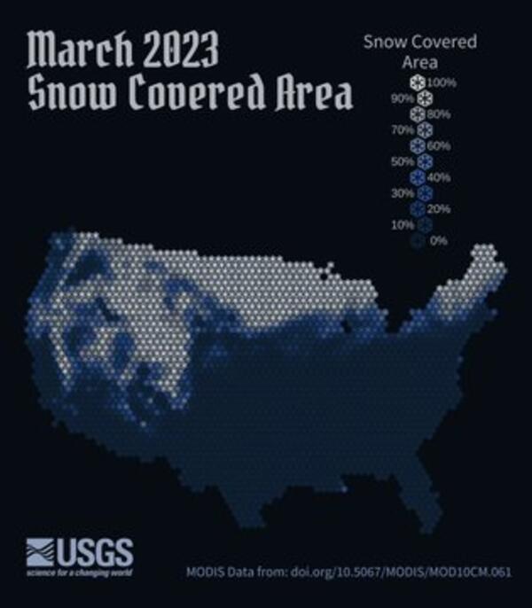
Relationships: positive/negative - March 2023 snow covered area
A map of the contiguous U.S. using a snowflake hex pattern to show snow cover for March 2023. Snowier places are white with snow, emphasizing the Rocky Mountains and Sierra range in the western U.S., the Upper Midwest, and Maine in the northeast.
A map of the contiguous U.S. using a snowflake hex pattern to show snow cover for March 2023. Snowier places are white with snow, emphasizing the Rocky Mountains and Sierra range in the western U.S., the Upper Midwest, and Maine in the northeast.